

This case study contains minimum product visuals as this is currently a pre-launch product in production. But sit back and enjoy the story.

Too Long, Didn’t Read
The story of how I shaped a brand, built a design system, and led a team to bring a sports technology product to life.
Rebuilt the brand from the ground up. Led the full rebrand from Sports Excitement to SPEX, including the new logo, color palette, and identity system that defined the tone for the entire product.
Created a unified design system. Consolidated inconsistent assets into a single, scalable system with defined components, typography, and accessibility standards used across all SPEX products.
Redefined how the app was designed. Shifted the team to a mobile-first approach, reshaped the app’s multi-hub ecosystem (Community, Gear, Teams, Events, and Messaging), and streamlined user flows for clarity and usability.
Improved UX consistency and performance. Cleaned up legacy designs, improved accessibility, and introduced research-backed interaction patterns that elevated both function and feel.
Built and led the SPEX UX Collective. Formed a cohesive cross-functional team of designers and researchers, established new workflows, and created a culture of collaboration, curiosity, and accountability.
Directed UX strategy and operations. Partnered with executive leadership to define company-wide UX priorities, align design with business goals, and oversee sprints, communication, and delivery across teams.
Project still in motion. The SPEX product is approaching launch, with continued refinement, usability testing, and design expansion underway. The foundation is solid and the evolution continues.
The Project
SPEX is a multi-portal sports tech app designed to bring every corner of the athletic world under one roof. The platform blends social media, e-commerce, event scheduling, and messaging into a single ecosystem that connects athletes, teams, and fans in new ways. With ambitions that stretch from grassroots sports to professional organizations, SPEX aims to be the all-in-one digital arena where sports communities thrive.
When I joined, the team had spent months stalled in debate over the most basic deliverables. Within five months, we shifted from standstill to a working MVP — a critical milestone that set the stage for full launch. This is an ongoing project, and I continue to lead the design effort as we push through the trenches toward official release to the public.

Version History: My UX Journey with the Company
v1.0 — UX Consultant (2020 – 2024)
UX Stage: Foundation
When I joined, the project was still searching for its identity, first a fitness app, then a broader concept in sports technology. I was brought in as a consultant while I was completing my UX education, helping define product direction, user needs, and MVP feasibility.
Impact:
Conducted early user and competitor analyses to shape the app’s purpose
Introduced accessibility and UX thinking to a team still operating on aesthetics alone
Helped leadership recognize how research and strategy could guide design decisions


v2.0 — Lead UX/UI Designer & UX Manager (2025)
UX Stage: Structure
By early 2025, the CEO asked me to step in and stabilize a UX department that had stalled in endless debate. My first objective was to rebuild structure, clarity, and trust — and to establish the foundation for a true UX practice within the company.
Impact:
Implemented the company’s first design system and organized previously chaotic Figma files
Established sprint schedules, design standards, and weekly design critique sessions
Founded the company’s UX Research department, defining methods and deliverables from the ground up
Actively participated in recruiting, interviewing, and mentoring designers and researchers to expand the team
Shifted the organization’s decision-making culture from opinion-based to data-informed across both design and product
v3.0 — Director of UX (2025 – Present)
UX Stage: Scale
With the department operating smoothly, my role expanded into strategy and cross-functional leadership. I now oversee UX direction for the multi-portal platform and lead ongoing brand and naming initiatives.
Impact:
Unified product, marketing, and development under a single design vision
Directed rebranding efforts and coordinated with legal on naming and trademark strategy
Continued evolving the design system into a scalable foundation for future products

The Product Journey
The Challenge
When I took over as Lead of the UX/UI Design team, the product was drifting without structure and the UX team was struggling to move forward. The design files were overloaded and disorganized, debates over the color palette had stalled progress, and communication between design, product, and marketing was almost nonexistent. My first task was clear: bring order to the chaos so the team could finally focus on building a product worth launching.

Early Wins
Before we could design great experiences, we had to create a space where great design could actually happen. My first few weeks as Lead of UX/UI were a complete overhaul of how our team worked:
Color sanity restored. Months of internal debate over the color palette ended when I reminded the team we were UX designers, not decorators. So I conducted a user survey to let our actual users decide. The result became our official, data-backed color system that balanced accessibility, brand recognition, and visual energy. (View the survey HERE, view results HERE)
Figma: cleaned and reborn. I archived years of chaotic design history (some of it truly terrifying) and built new, organized files that loaded quickly, followed naming conventions, and were easy to navigate.
Design system established. Introduced a unified system that standardized fonts, sizing, iconography, spacing (hello, 8px grid), and reusable components, giving us consistent UI and faster design-to-dev handoffs.
Visual consistency overhaul. Ran a UI audit to document every inconsistency, then rolled out updates for typography hierarchy, button states, corner radius, and touch target specs.
Process and collaboration. Formalized design-to-dev handoffs, created dedicated feedback sessions, and built stronger communication between UX, Product, Dev, and Marketing so the left and right hands finally worked together.
“These foundational changes didn’t just make our designs cleaner, they gave our team clarity, confidence, and a shared language to move forward.”
Design System: Taming the Chaos
Our growing product needed a shared language that could scale across features, teams, and future releases. The SPEX Design System became that foundation.
Core Goals

Every designer and developer needed the same visual language. The system defined how color, typography, and components work together so design decisions became predictable and scalable.
Create Clarity

Buttons, cards, icons, and spacing now share one set of rules. The result is a product that feels cohesive across every SPEX feature, from Gear Hub to Community.
Build Consistency
Reusable components and tokenized styles cut design time in half and reduced development rework. Teams could focus on innovation instead of chasing alignment.
Work Faster


All colors, text sizes, and interactions were checked for WCAG compliance to make sure the experience works for everyone.
Stay Accessible

Component Examples from the Component Library


With the system in place, designers could build faster, developers could implement with confidence, and every new product feature felt cohesive. The design system became the single source of truth across design, product, and marketing.
How UX Thinking Led to a New Brand Identity

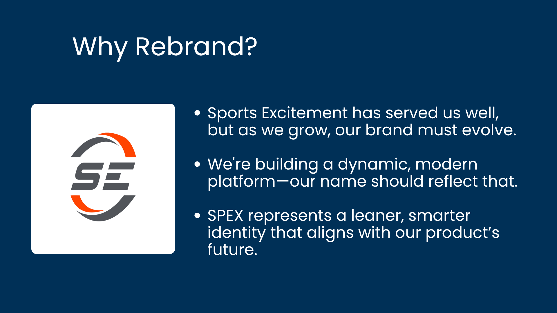
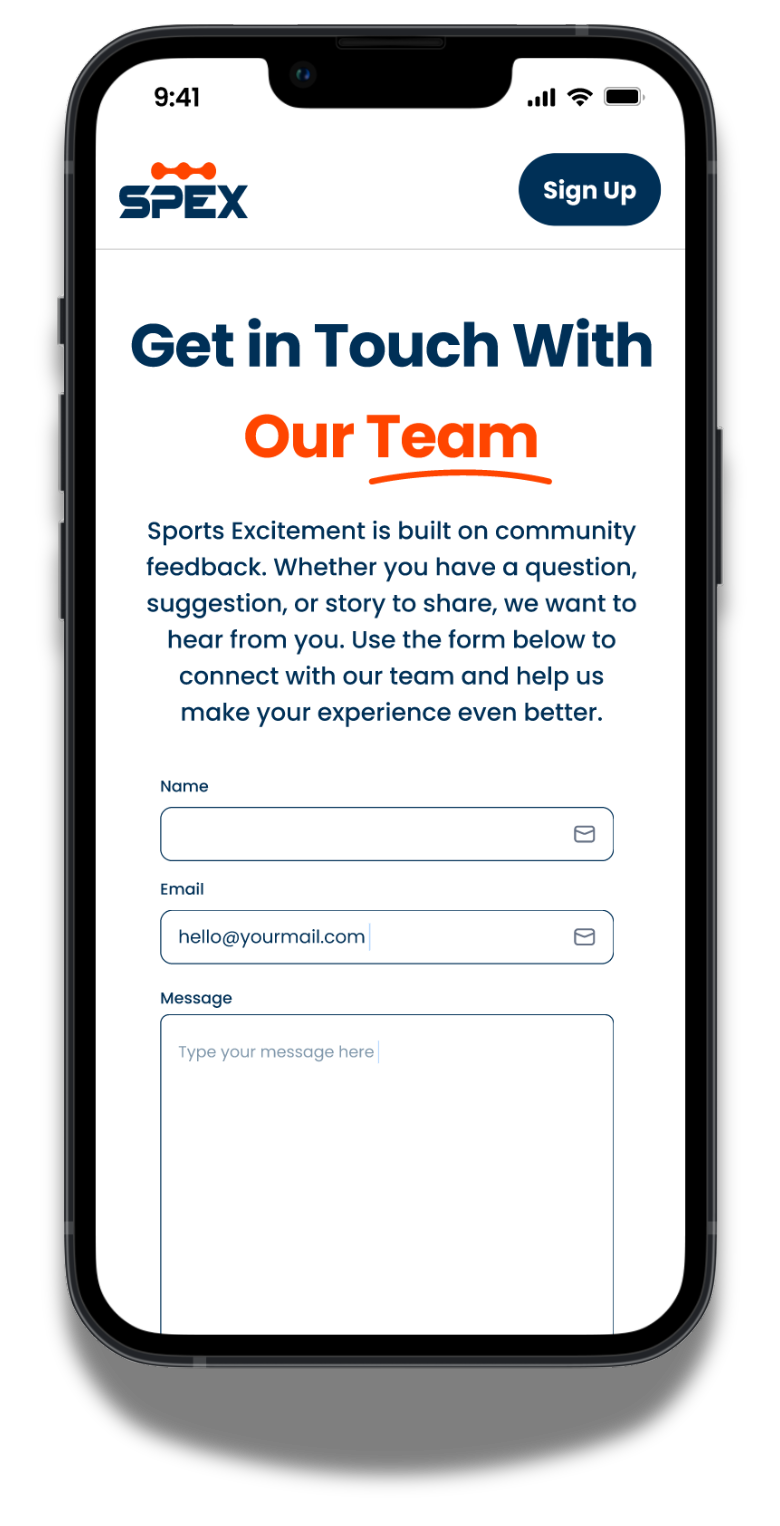
For years, our product shared its name with the parent company, Sports Excitement LLC. The company was running three major projects, and while the other two had their own unique names, our flagship product still operated under the parent brand. The overlap created confusion, even internally, about where the company ended and the product began.
We didn’t need a new logo. We needed a new identity.

The existing Sports Excitement logo had some design issues that I felt that needed to be updated, such as the kerning issues shown above.
During a collaborative brand session about the existing Sports Excitement logo with Luis Fernando Ribeiro, our Senior Graphic Designer, we explored visual directions for our product. That’s when a rejected logo prototype sparked the idea that changed everything.
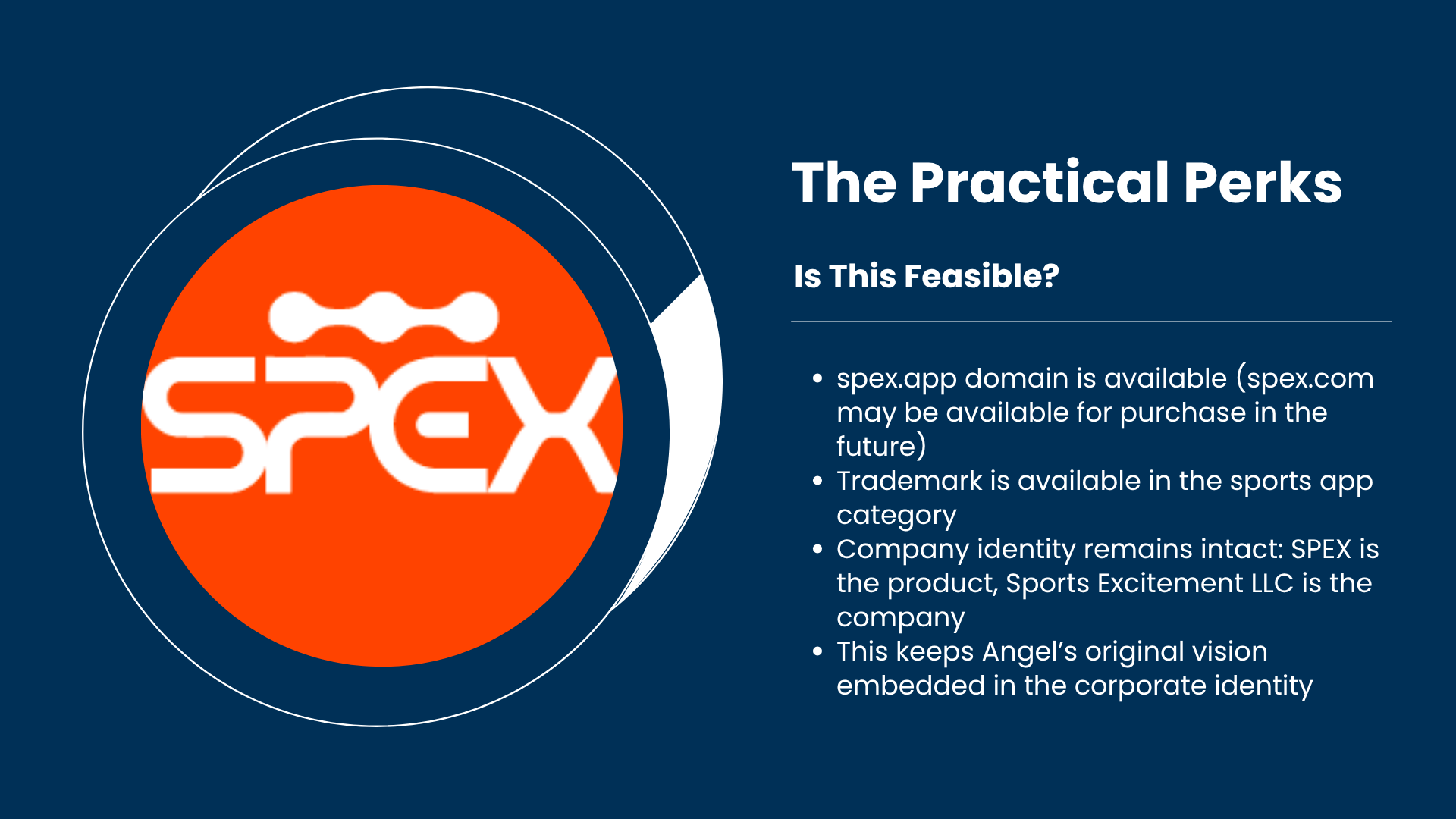
While reviewing the design, I said offhand, “SPEX would actually make a great name for the app.” Luis stopped mid-scroll and we both had an AHA moment!. It was one of those rare moments of instant clarity. Within minutes, we were running trademark and domain searches. Everything was available.
SPEX brought clarity on every level. It created a clear distinction between the company and its flagship product. It shortened a cumbersome name into something smart, unique, and easy to recall.
Four letters, simple to spell
Reduces cognitive load and improves memorability
Distinct visual identity that fits our modern UX-driven product
Perfect for the tech landscape where short names of 4-6 letters thrive
To solidify the rebrand, I built a presentation outlining the cognitive and strategic advantages of the name change. The data, paired with the new visuals, made the case immediately clear:
SPEX wasn’t just a new name. It was a smarter identity.


SPEX logo ideation


The Final SPEX Logo Design
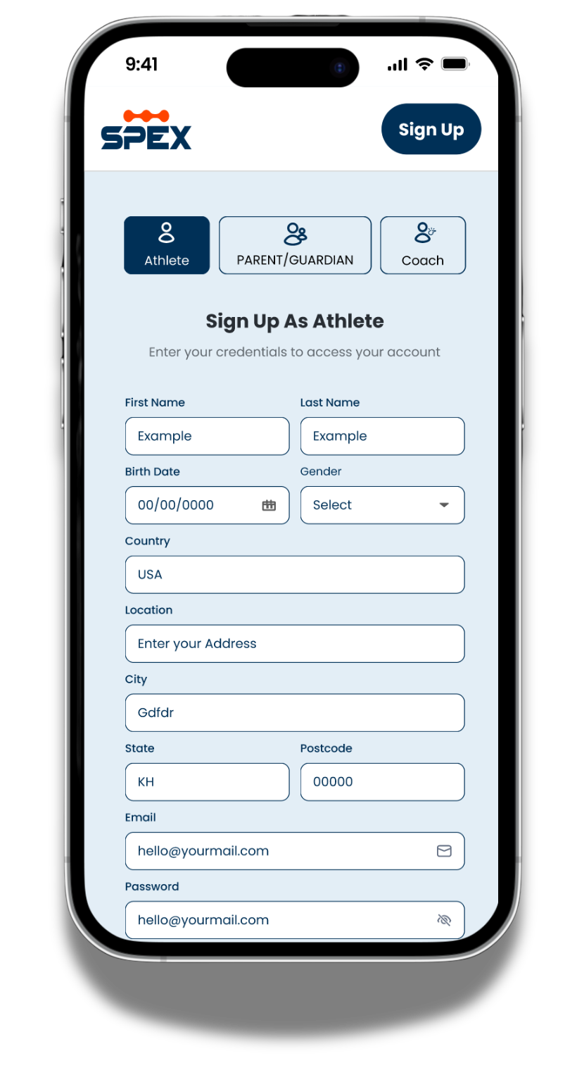
Evolving the SPEX App: Connected Hubs, Consistent Design
Overview:
The SPEX Ecosystem
SPEX is a multi-hub sports platform that connects athletes, coaches, and fans through community, commerce, and communication. The app includes:
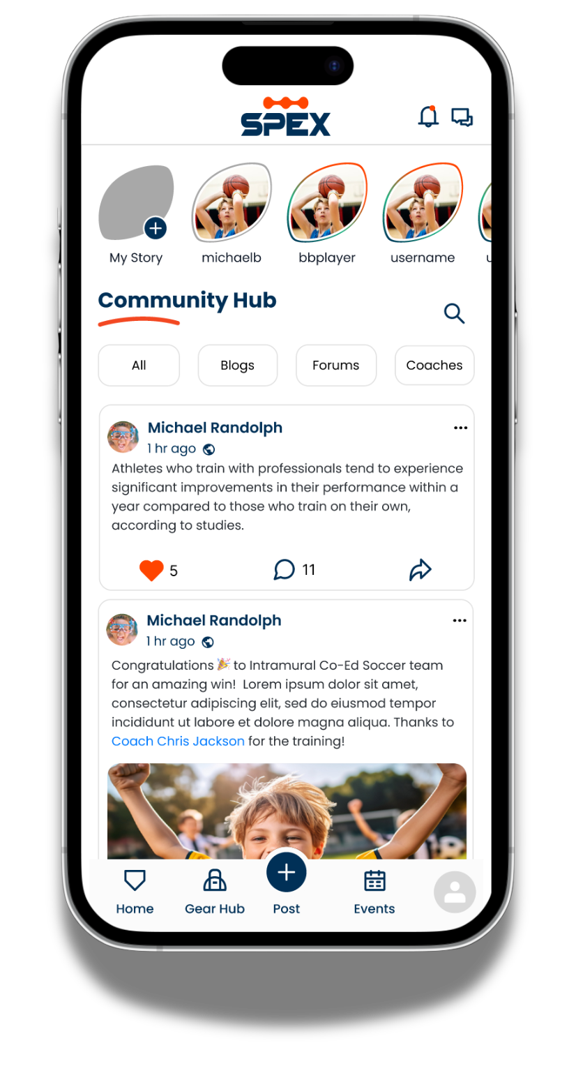
Community Hub: The social home of the app, where users share sports-related content and interact with one another.
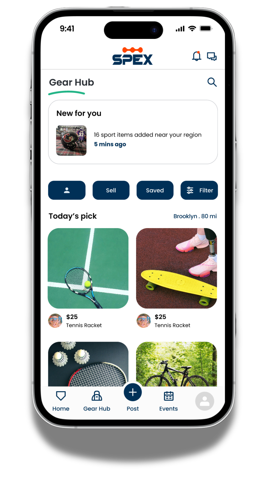
Gear Hub: A peer-to-peer marketplace for used sports gear and memorabilia (no direct payment processing).
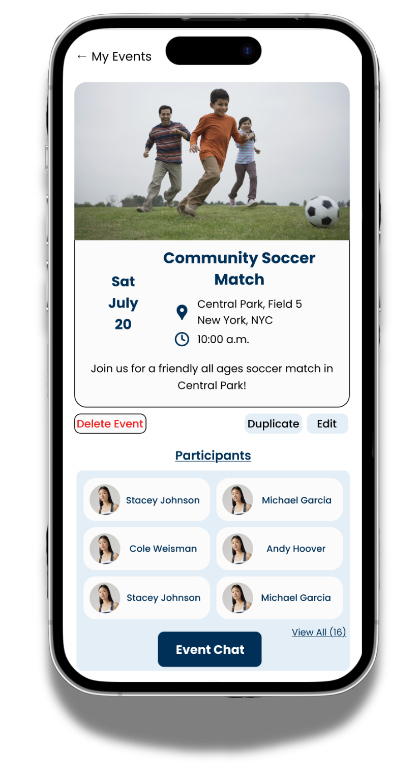
Teams Hub: A private space for teams to communicate, access schedules, and message individually or as a group.
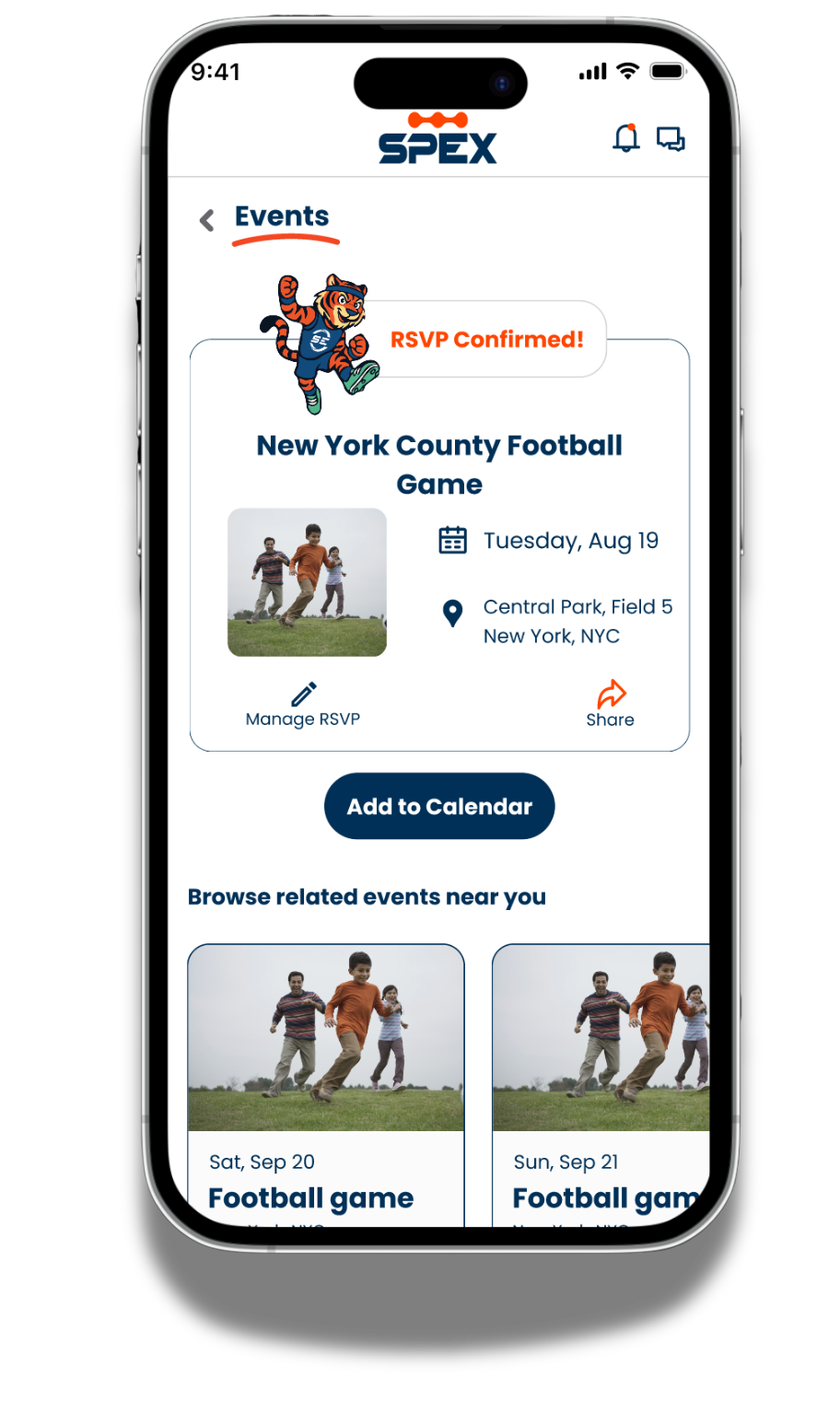
Events & Messaging: Separate hubs for discovering events and direct communication between users.
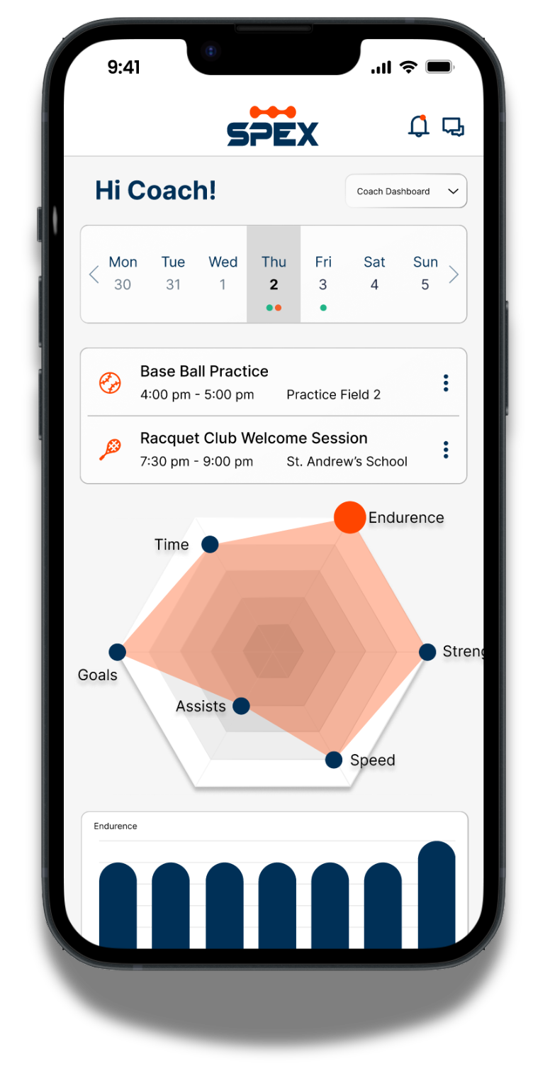
Future development includes an Athlete Dashboard that will visualize performance data entered by coaches.

The Problem
When I took over as lead, several sections of the app were already underway but lacked cohesion. The designs were inconsistent across color, typography, icons, and components. Designers were creating desktop-first layouts that looked good on larger screens but didn’t translate well to mobile, which is our users’ primary access point. Without a unified approach or clear user flows, progress felt fragmented and inefficient.
Shift in Strategy
I refocused the team around two core principles: consistency and clarity. The design system solved the visual inconsistencies, while a mobile-first design approach ensured the experience met users where they were.
Each new section began with flow diagrams and sketches to map the user journey before jumping into visual design. The team built flows for areas like the Gear Hub and Community Hub, which exposed missing pages and improved navigation logic across the app.

Visual and Structural Evolution
The rebrand carried through every screen. The updated color palette and typography gave the product a distinct identity, complemented by a new mascot, Flex the Tiger, who brings energy and approachability to the interface. Accessibility checks became part of our review rhythm, especially for color contrast challenges involving SPEX’s signature orange.
In the Gear Hub, we refined interaction patterns to handle complex seller workflows like bulk uploads and discount logic while maintaining intuitive browsing for buyers.

Cross Functional Collaboration
The redesign effort also redefined how our teams worked together. Product owners guided the feature set for the Community Hub, while the newly formed UX Research team supported the Teams Hub with competitive analysis, user interviews, and usability testing. This balance of research-driven design and stakeholder insight kept the ecosystem grounded in user needs while moving efficiently toward MVP goals.
Outcomes and Impact
The redesign delivered measurable improvements in the user experience and brought new energy to the team behind it. The combination of mobile-first thinking, stronger collaboration, and design consistency created a product that feels cohesive, intuitive, and genuinely enjoyable to use.
Key Outcomes
Improved usability: Simplified flows and a consistent layout made navigation across hubs faster and clearer.
Mobile-first success: Optimized spacing, tap targets, and readability improved interaction on smaller screens.
Stronger collaboration: Designers, researchers, and developers worked more efficiently through shared templates and streamlined Figma workflows.
Team engagement: A renewed sense of pride and ownership led to higher-quality design reviews and faster iterations.
Consistent brand experience: Unified components and accessibility checks created visual harmony across the entire app ecosystem.
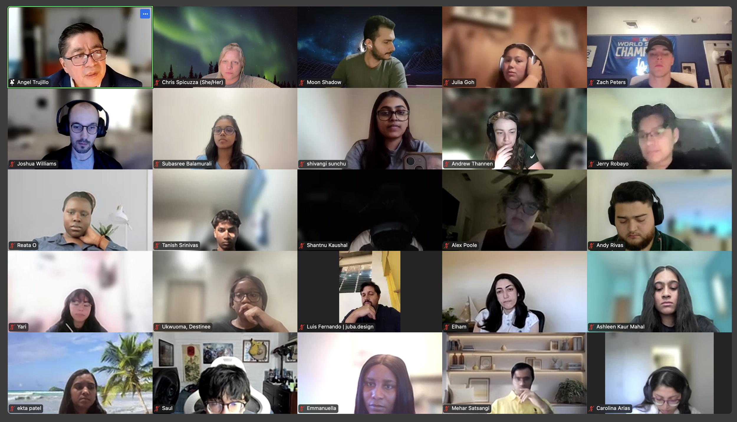
Building the SPEX UX Collective

Pioneering UX Research
For many years there was no dedicated research function at Sports Excitement, LLC. I built the UX Research team from the ground up, defining roles, creating process guidelines, and positioning research as a critical driver of product decisions. Within months, researchers were conducting usability tests, competitive audits, and user interviews that directly informed design direction.

Leadership in UX Design
For the SPEX design team, I established a framework that balances creativity with accountability. I lead designers through every stage of our process, from early exploration to final delivery, helping them translate research insights into intuitive, visually unified products. Through consistent feedback, mentorship, and collaboration, I’ve built a team that takes ownership of their work, understands the intent behind every design choice, and produces solutions that serve both users and business goals.

Designing the Right Team
I believe strong design starts with strong collaboration. At SPEX, I’ve built an environment where designers, researchers, and product teams work transparently toward shared goals. I lead hiring and portfolio reviews for both UX Design and UX Research, looking for people who bring curiosity, empathy, and a collaborative mindset. Beyond technical skill, I value designers who think critically about users and take ownership of the product experience. Through intentional hiring, mentorship, and a culture grounded in open communication, I’ve built a team that designs with confidence and purpose.
Operational and Strategic Oversight
As Director of UX, I work closely with executive leadership to shape the goals and direction of the company’s products, brand, and overall user experience strategy. My role bridges vision and execution by translating high-level objectives into actionable design priorities that guide our roadmap. I collaborate directly with product and development leadership to define feature direction, refine workflows, and ensure user-centered thinking drives every initiative. Alongside strategic planning, I oversee sprints, track progress, and maintain clear communication across teams to keep SPEX design efforts cohesive, efficient, and aligned with company-wide objectives.
The SPEX product is still in active development, and our work continues to evolve every week. The foundation is built, the design system is strong, and the user experience has been defined through research, iteration, and collaboration. Our focus now is on refinement, testing, and preparing for public launch.
Although the product isn’t live yet, the groundwork laid by the UX Collective ensures that when SPEX does launch, it will do so with a unified identity, clear structure, and a deep understanding of its users. Every hub, every flow, and every visual detail has been shaped with intention.
For me, this project represents more than a product design, it’s the creation of an ecosystem built to grow. The work continues as we refine the user journey, expand feature sets, and prepare to introduce SPEX to the world.
Come Back for Future Updates!
